I have seen a lot of questions related to hiding/showing a section on desktop and mobile.
Most of us will target data-section-id and use display: none code.
If you need to hide many sections, you will need to target many ids, and sometimes cause inconvenience to your clients.
This tip will demonstrate another way to hide a section on desktop or mobile.
#1. Add this code to Custom CSS
@media screen and (min-width:768px) {
 section:has(.hide-on-desktop) {
     display: none !important;
   }}
 @media screen and (max-width:767px) {
 section:has(.hide-on-mobile){
     display: none !important;
   }
 }

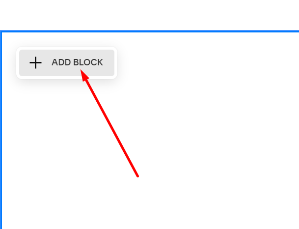
#2. Edit Section where you want to hide on Desktop or hide on Mobile and add a Code Block
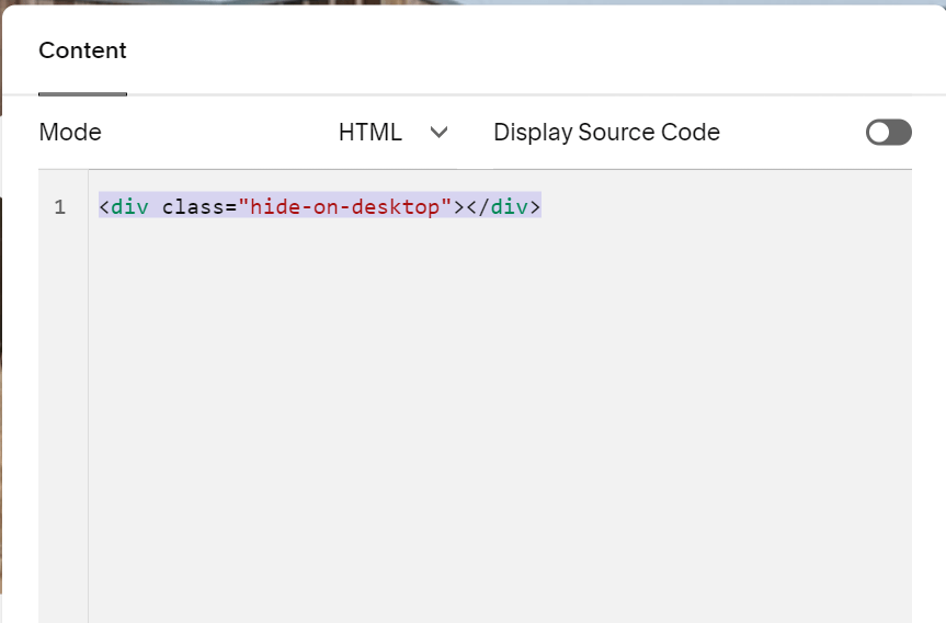
Then use corresponding code, if you want to hide section on Desktop
<div class="hide-on-desktop"></div>
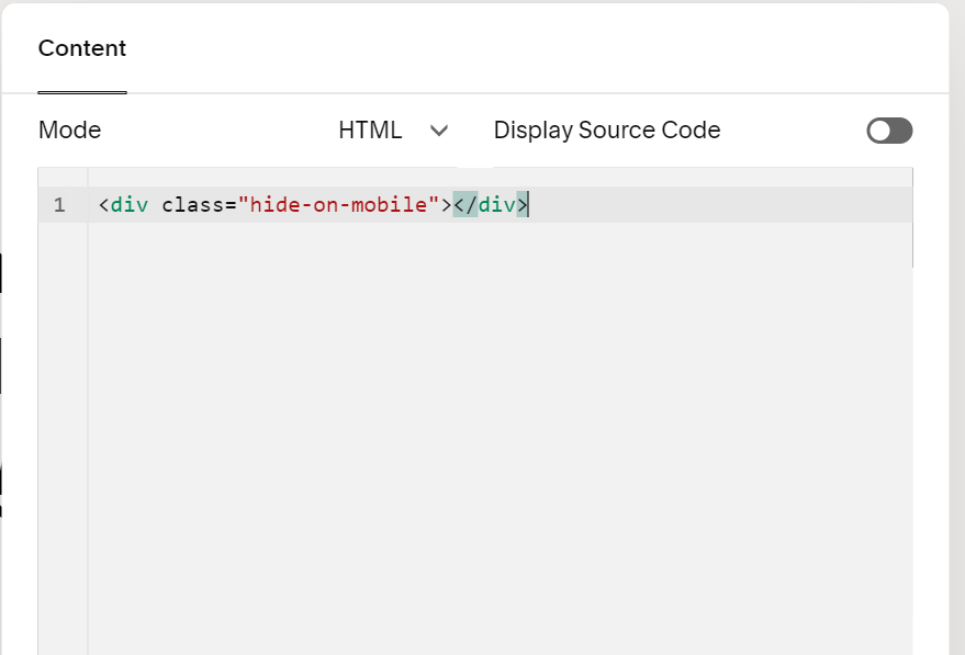
OR this code, if you want to hide section on Mobile
<div class="hide-on-mobile"></div>
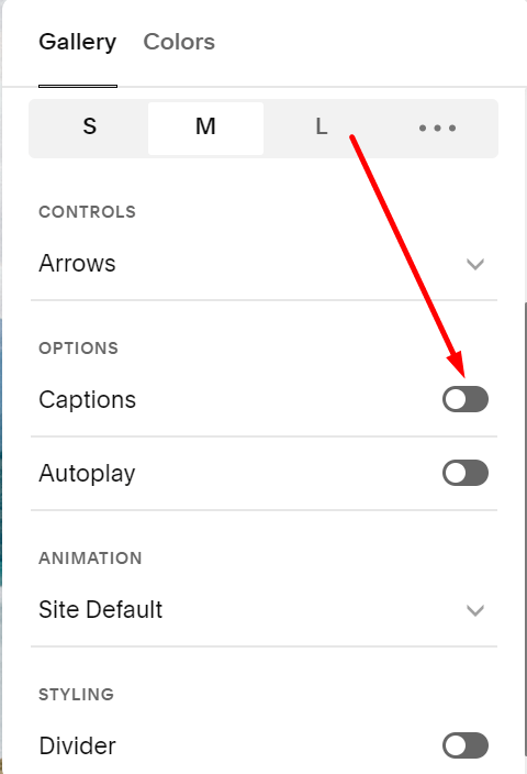
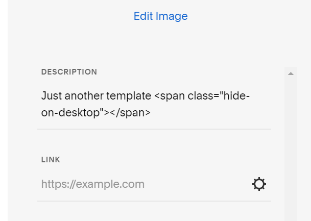
#3. If you want to hide Gallery Section (Image Section), add this code to Caption box
<span class="hide-on-desktop"></span>
Do similar if you want to hide on mobile
<span class="hide-on-mobile"></span>
and make sure caption is enabled