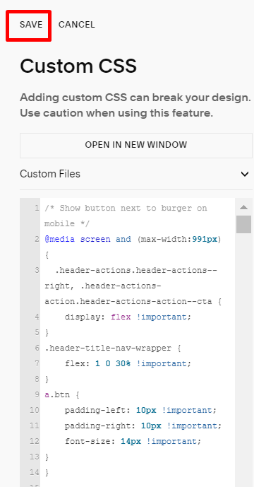
#1. Add this code to Custom CSS box and click Save
/* Show button next to burger on mobile */
@media screen and (max-width:991px) {
  .header-actions.header-actions--right, .header-actions-action.header-actions-action--cta {
    display: flex !important;
}
.header-title-nav-wrapper {
    flex: 1 0 30% !important;
}
a.btn {
    padding-left: 10px !important;
    padding-right: 10px !important;
    font-size: 14px !important;
}
}
#2. You will have a result like this
